08 Apr Colour of the Year, 2019
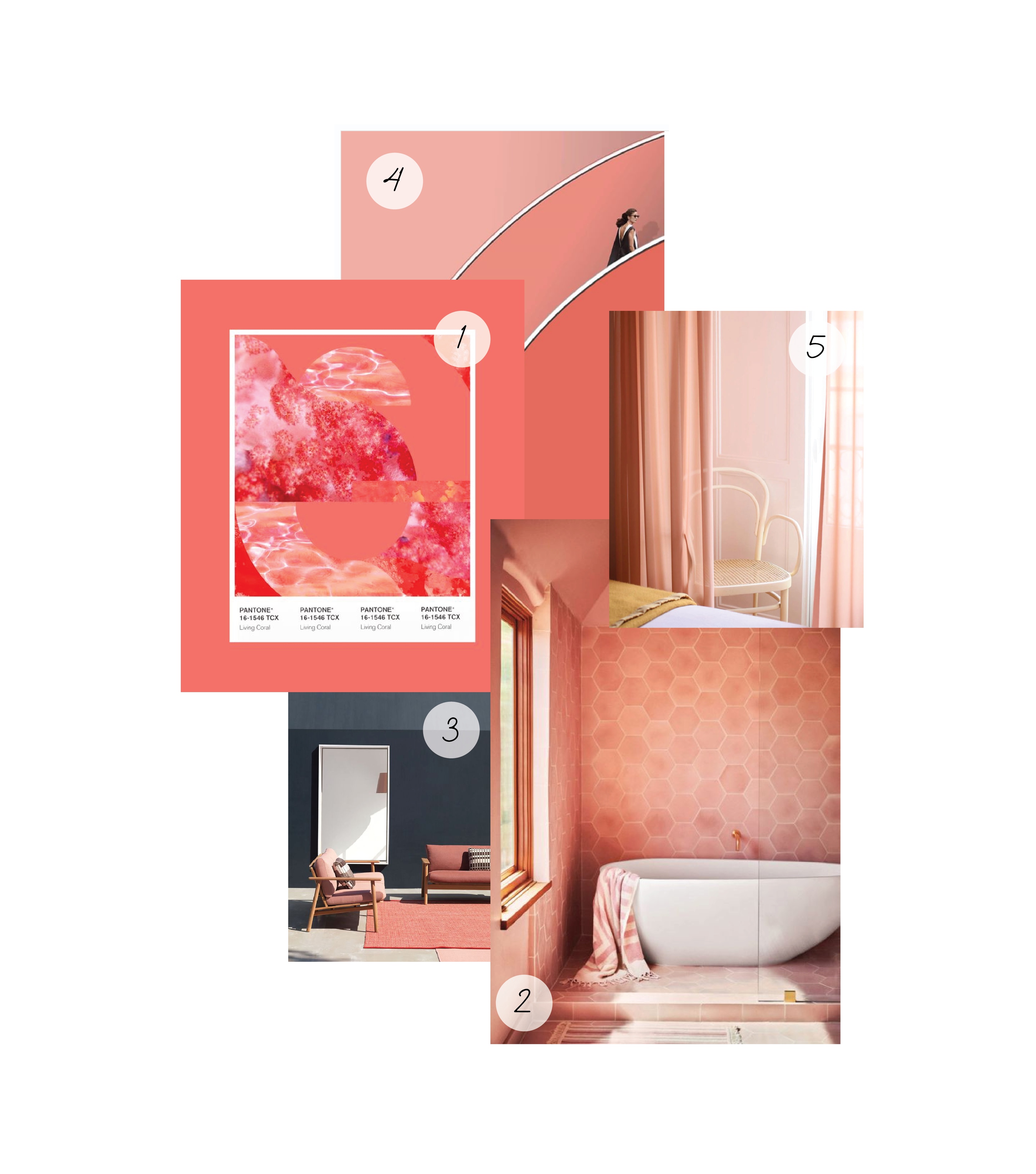
Introducing the 2019 colour of the year – ‘Living Coral’, as described by Pantone as “an animating and life-affirming coral hue.” Inspired by the natural beauty of living coral, this colour “symbolises our innate need for optimism and joyful pursuits.”
Let’s look at ways in which Interior Designers have used this colour to achieve interesting design outcomes that are unique to our senses.
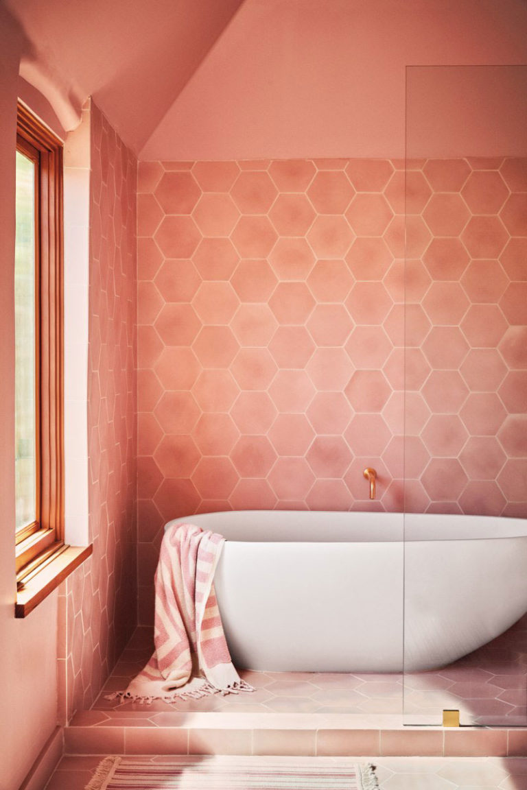
 Image courtesy of https://www.bloglovin.com/blogs/sfgirlbybay-779944/color-story-living-coral-6694810679
How could anyone feel unhappy in this room? The designer has made a bold choice, immersing the user in all this pastel pink. How have they pulled if off? By softening the energetic colour with natural light and natural textures, as seen in the timber window trim. The use of copper adds another layer of texture and gives it that extra pop. A striking example of the colour in full swing, where all elements of design are working in perfect harmony.
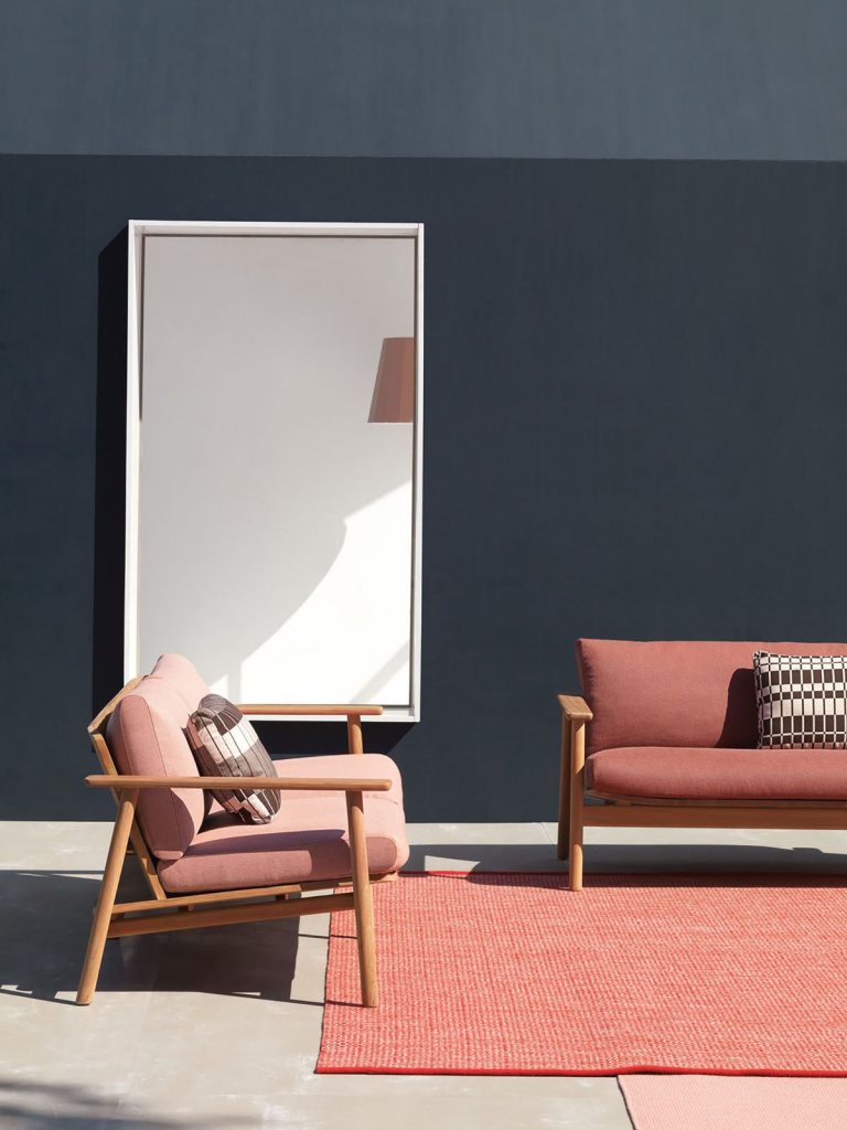
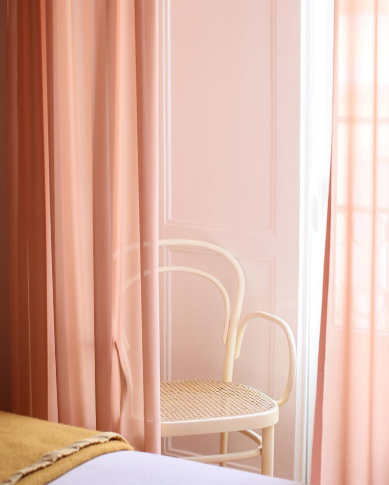
For a more subtle look, start by introducing the colour on window and door trims and complement it with a contrasting colour like white or a grey. Maintain harmony in the space by adding pops of the colour to soft furnishings like rugs and cushions, and decorative items on display.
 Image courtesy of https://www.dwell.com/article/riva-collection-by-jasper-morrison-06af3e62/6263067180412051456
 Image courtesy https://www.sfgirlbybay.com/
As seen in the feature image:
Image 1 courtesy of https://www.refinery29.com/en-us/pantone-color-of-the-year-2019-living-coral
Image 4 courtesy of https://www.instagram.com/p/BsdTbnjAgtn/

